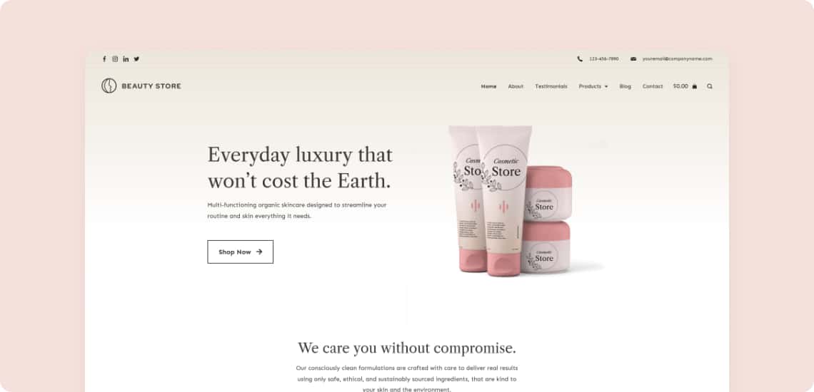
Beauty Store
2022
Client Project
Art Direction
Problem
- Have clear ways of locating specific products
- Support a single page for each product which can be linked to directly
- Have an efficient way of purchasing one or more products
- Have clear ways of locating specific products

Solution
- Have clear ways of locating specific products
- Support a single page for each product which can be linked to directly
- Have an efficient way of purchasing one or more products

Process
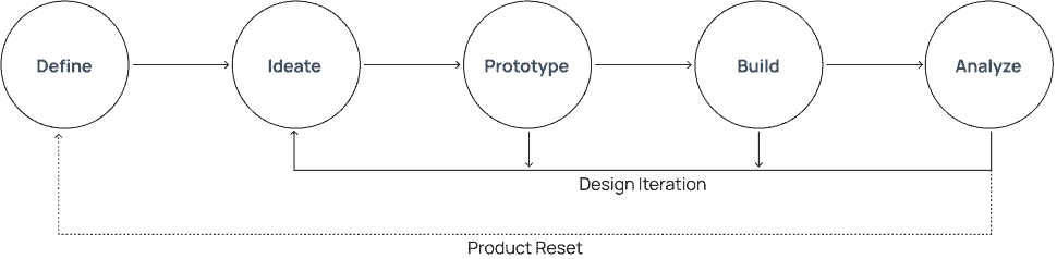
Research
User Research
Competitive Anaylsis
Empathy Map, Persona
Sketch and Wireframes
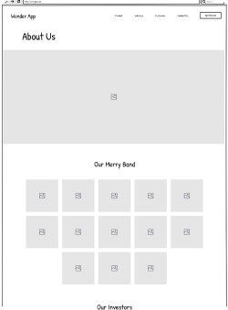
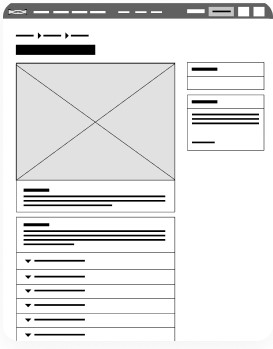
Sketch and Wireframes
Usability Testing Results
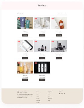
The addition of a brand filter to the category page made it much easier to find certain products. People rushed to the department and then headed to their favorite brands to look around, as seen in the store.
It’s fantastic to see that approach reflected and operating on the website. It was simple to choose a color and add sizes to the cart; they even introduced more colors as a result!
The checkout procedure went well, and now that the buttons are properly labeled, the user felt much more at ease and relaxed once the transaction was completed.
Conclusion
The inclusion of a brand filter to the category page made finding specific products much easier. As observed in the store, people hurried to the section before heading to their favorite brands to browse around. That approach is mirrored and operational on the website, which is excellent.
It was straightforward to select a color and add sizes to the cart; as a result, they launched more hues!
The checkout process went well, and the user felt much more at ease and calm after the transaction was done now that the buttons were appropriately labeled.